Casa Group
Brand Identity
Website Design
Promotional Design

Casa believes that your point-of-sale system (aka “POS” in the biz) should be like a microwave – it’s fast and always works. They also believe that support shouldn’t be painful—especially when there are orders to fill and diners starting to get hangry.
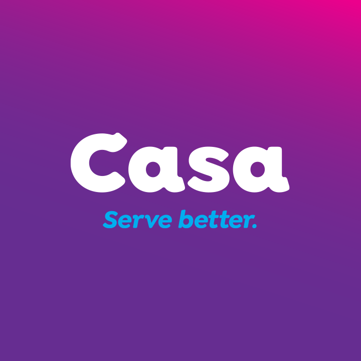
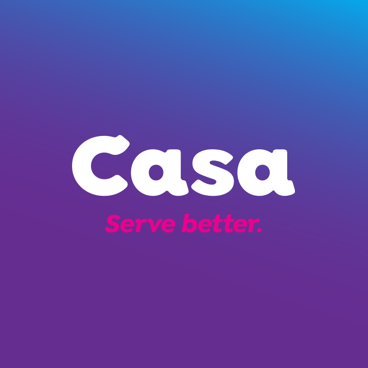
We designed their wordmark to be inviting with a positive personality. Uncommon amongst their competitors, the deep violet hue of Casa Purple stands out and refuses to remain obscure. It is complimented by cyan and magenta accents and calls to action as well as gradients and gradient overlays.
Their tag line, “Serve better,” is also an abbreviated version of their mission statement. Casa strives to serve their customers better so they can serve their guests better.
